In short
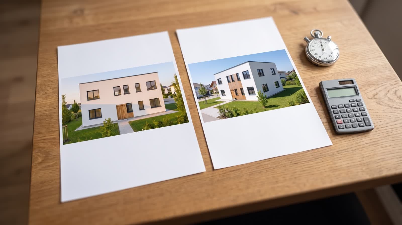
A fair comparison of variants needs three fixed quantities: the same camera, the same light, the same surroundings. Only the material may change. As soon as viewpoint or time of day change too, you compare moods instead of facades. Three variants side by side are enough; from five on, the order matters more than the material.
Why sample boards deceive
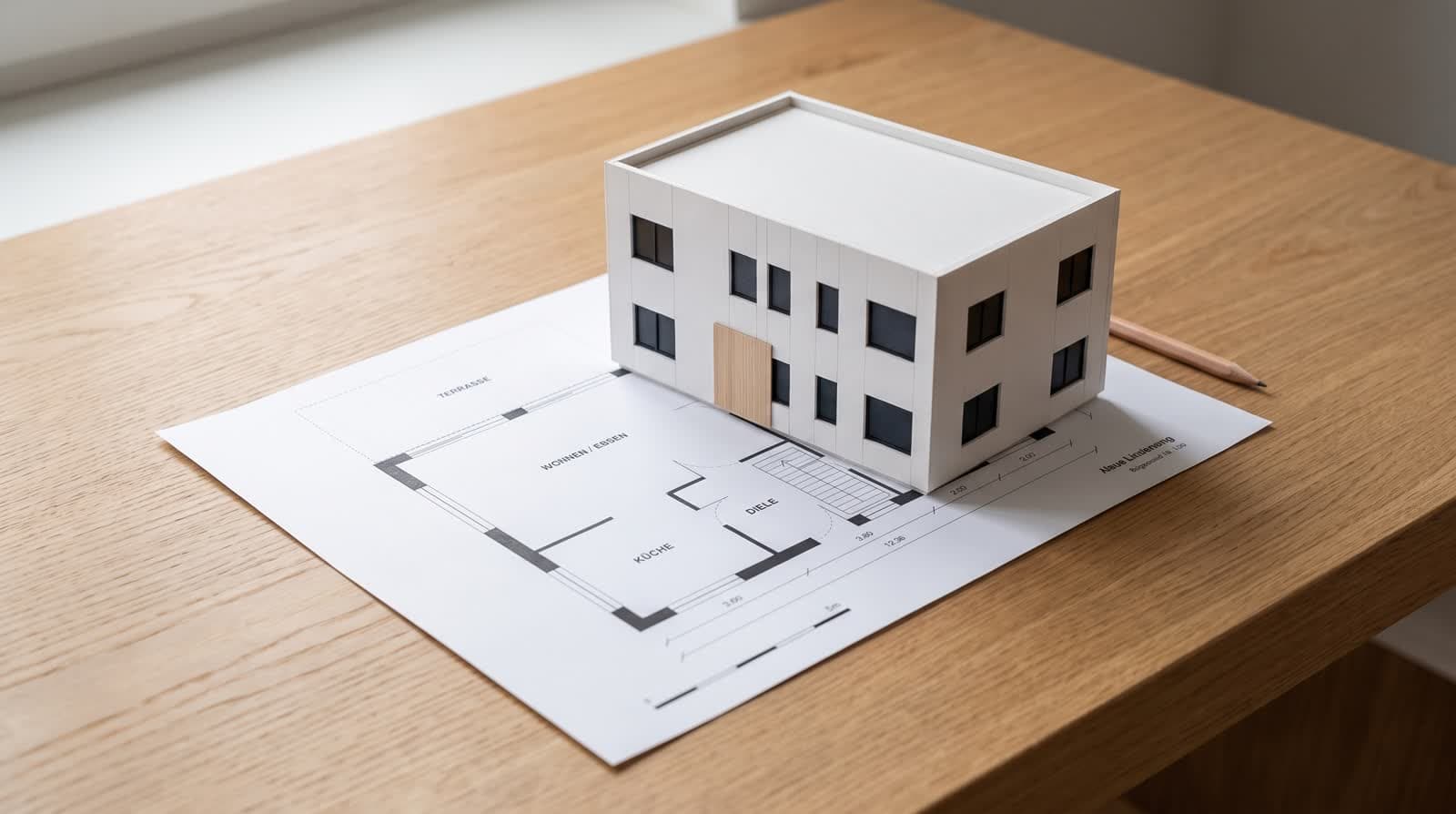
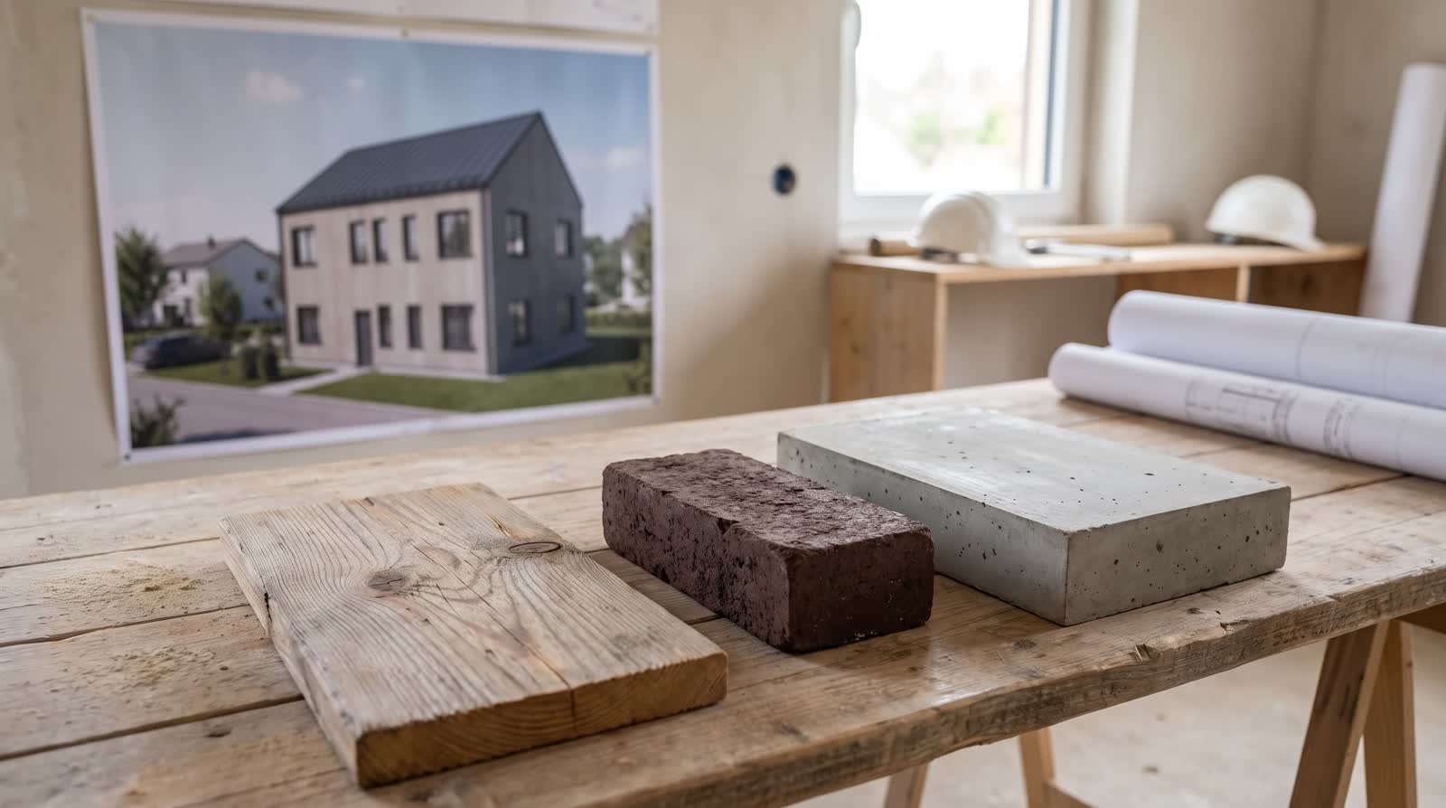
A sample on the table shows colour and texture from 30 centimetres, under indoor lighting. On the house the same surface works over ten metres, in daylight, with shadows from projections and recesses. Light renders seem larger, dark brick seems heavier, timber changes over the years.
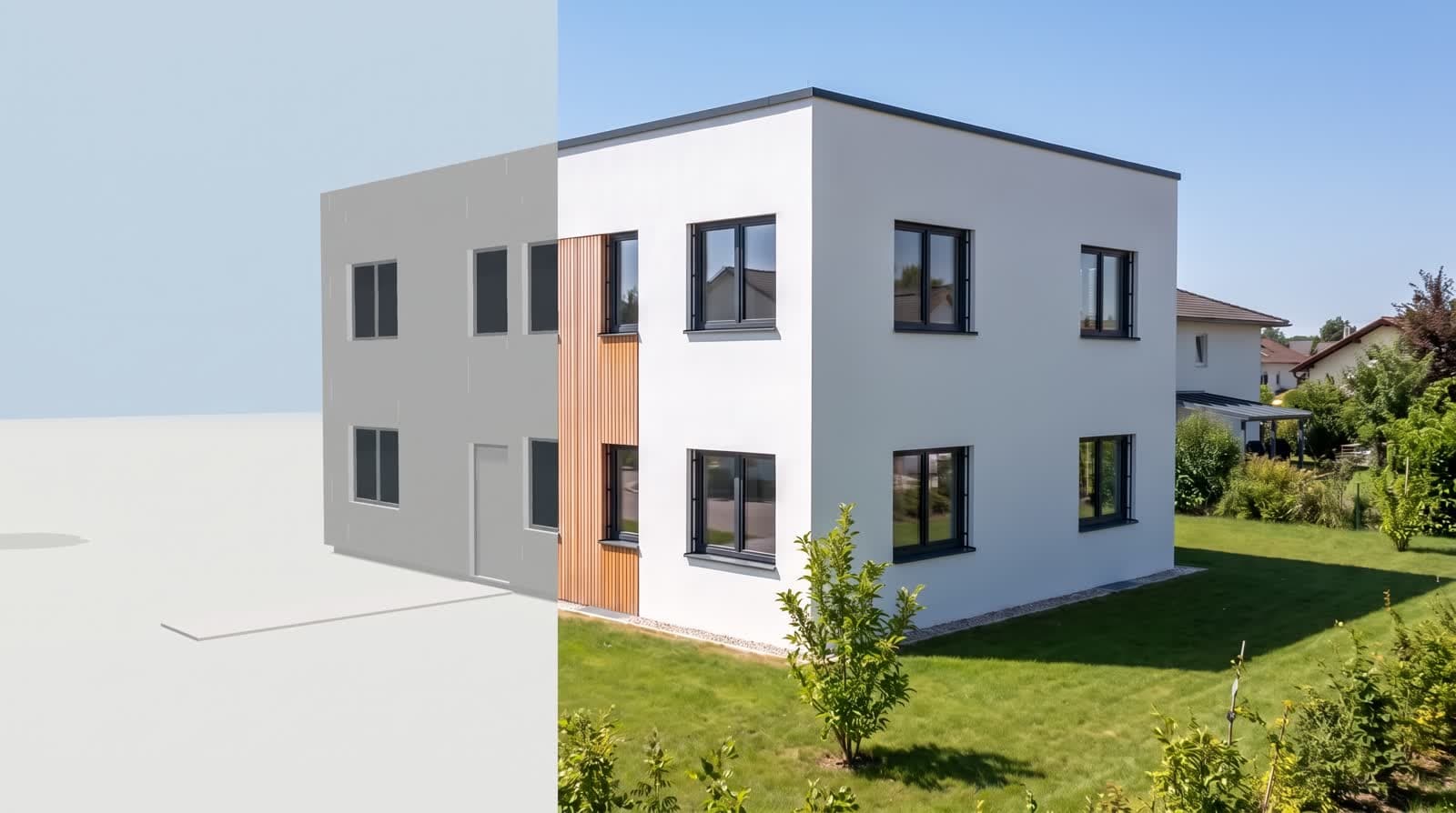
That is why comparing on the model is no gimmick: it shows surface, edge and light at the size at which the decision will later be made.
Rules for a fair comparison
- 01One cameraFix the viewpoint before the first variant.
- 02One time of dayAfternoon light shows materiality most clearly; what matters is only that all variants share the same time.
- 03The same surroundingsIf one variant is shown with neighbouring buildings and another without, the surroundings decide.
- 04The same cropNo zooming into the nicer corner.
What works together
Facade, frame and roof form a triangle. White render with anthracite frames looks sharp and modern; the same facade with timber frames looks considerably softer. Brick with a light window looks traditional, with dark frames urban.
If you only try out the wall colour, you decide half the effect. Include the frame colour in the comparison.
How many variants, and how to compare in the meeting
Three. With two there is no reference, from five on the variant in the middle wins because it is looked at most often. If more materials are in play, decide in two rounds: first the family (render, timber, stone), then the execution.
A client decides more easily when seeing the variants side by side and able to switch themselves. A link with the same three views is more practical than PDFs in an attachment, and it can be extended if a fourth idea arises in the meeting. How that looks is described under [client approval]client approval.
The comparison in detail
Material effect is decided in three places, not on the surface: at the window reveal, at the plinth and at the parapet. There material, shadow and edge meet. When comparing variants, show a crop containing exactly these places next to the overall view, the same crop for every variant. A decision often turns right there, although the overall view suggested no difference.
From variant to execution, and cost
An image decides the direction, not the order. For execution the sampling remains authoritative: colour by colour chart, brick by sorting, timber by grade and surface. More on the approach under [material variants]material variants.
Sample area on site
On larger projects a sample area of a few square metres, judged in daylight, is worthwhile.
Screen is not wall
Displays show colours more saturated. If you decide from an image, confirm the colour on the sample.
Cost of another variant
Once the model stands, a further variant essentially costs one more image call. Instead of settling on two variants in advance because each costs money, you try three and decide on the image. See [what an architectural rendering costs]architectural rendering cost.
Questions and answers
How many variants should I show?
Three. With two the yardstick is missing, from five on the order matters more than the material.
Are the colours binding?
No. Screens and prints reproduce colours differently. For execution the sample remains authoritative; the image decides effect and surface.
Can I compare the roof as well?
Yes. Roof shape and covering change the effect strongly, especially on pitched roofs. Keep the camera fixed then.
What about ageing?
Timber turns grey, brick stays, render becomes blotchy at the eaves. No image shows this development; it belongs in the conversation.